Busting myths about High Performance HMI
What happens when you replace complicated screens with a simple, minimalist user interface? We answer four common myths about High Performance HMI.

The human brain is remarkable. When we process visual information, our mind arranges what we are seeing for understanding, rather than offer a simple reflection of what is shown. However, our ability to do this breaks down when presented with imagery that is overly complex, uses too many different colours and provides no focal point or logical flow.
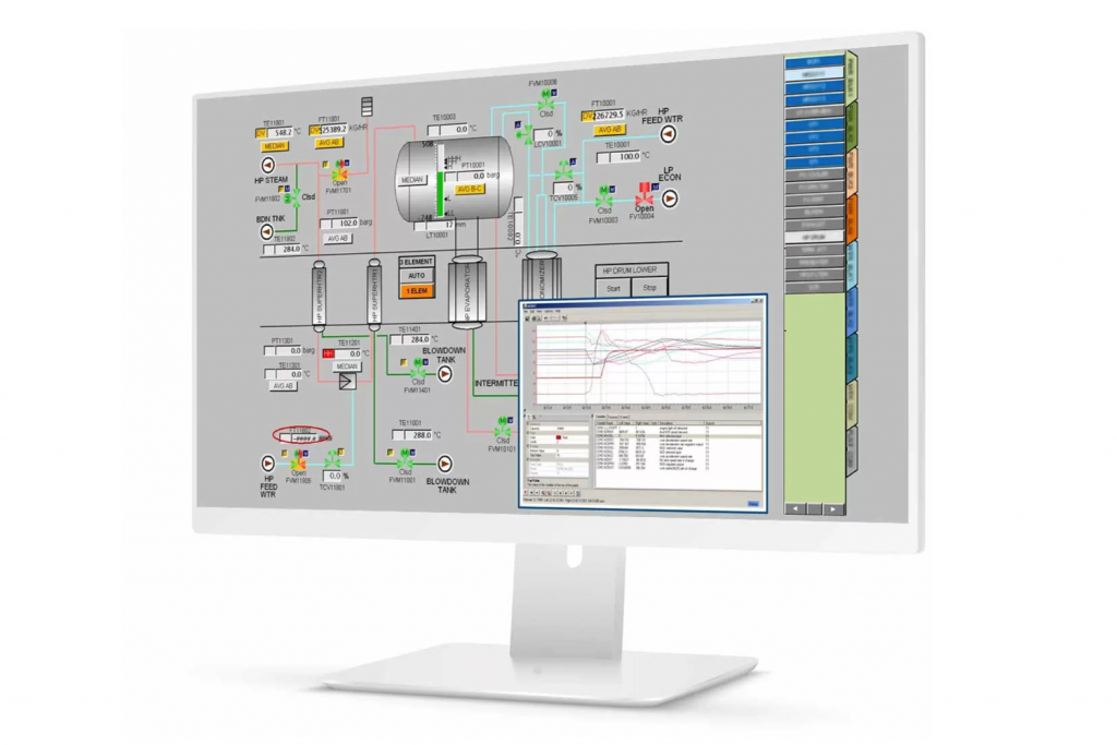
Take for example the image below. Visually, it’s like the odds and ends drawer in your kitchen where you can never find anything quickly. It’s distracting, and abnormal conditions don’t stand out. Visual presentations like this require advanced training, and slow down an operator’s ability to respond to emerging problems.

HMI screens like this one are distracting and makes it hard for operators to quickly identify abnormalities
Myth 1:
High Performance HMI is just a bunch of boring, grayscale, feature less screens, and it can’t make me a better operator.
The High Performance HMI standard covers a wide range of topics that simplify the interface, speed operator response time, improve problem and alarm resolution, while reducing errors and mistakes. Colour and greyscale are part of the standard, but it’s not exclusively about colour. It also includes contextual layout, navigation, shapes, typography and more.

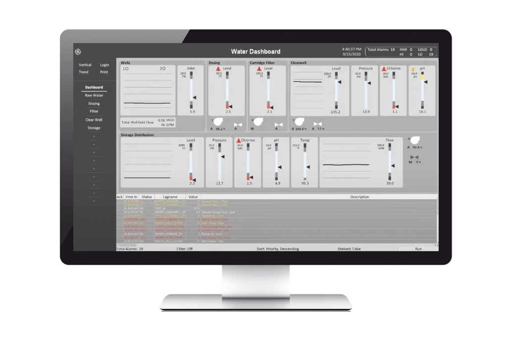
High Performance HMI screens come with a simple selection of colours, shapes and typography, to easily illustrate whether the production is running correctly.

When the different colours and shapes are put together, you get an optimised user interface that immediately gives the operator a good overview.
Advanced HMI screens also take lighting into account, and provide equally good images indoor and outdoor, during both day and night.
Myth 2:
I need a complete, real-world representation of the process.
Look at the pictures below. The illustration on the left is a real representation of the metro network in Oslo. In the picture to the right, the different lines are structured, and each line has its own colour, which makes it easier to visualise the journey.

Structured images are easier to navigate, and we understand them faster. Illustrations: Wikimedia Commons.
When you do a web search for optical illusions you will find dozens of examples. They are fun to watch, but more critically, they show us clearly how our brain re-orients visual signals in an attempt to make sense of what we are seeing.
The same principal applies for operators trying to pull out signals form very complex system representations. We need to reflect information in a manner that is easy to scan for anomaly and identify areas that require action.
Myth 3:
My screens are unique to me and my process. High Performance HMI is cookie cutter and one-size-fits-all.
High Performance HMI is a framework that can be applied to any production environment. A wide range of visual elements allows you to customise screens for your purpose. By using simple, repeatable shapes and a basic colour palette, abnormal situations are more clearly highlighted. Everything you need is still available but is presented in a new interface. You can spend less time searching and navigating and make decisions faster.
Do you want to create your own dashboards for visualisation via drag & drop, completely without code? See Proficy Operations Hub here.
Myth 4:
I’ve been using the same screens for 10 years, I know where everything is.
When you are familiar with traditional monitors, it can be difficult to undergo a change. We have seen experienced operators be pleasantly surprised when the new approach is compared with the old system. High Performance HMI is a bit like cleaning up the office. You still have all the necessary tools available – but it will be easier to find them.
Many manufacturing companies have operators who specialise in their field. They know everything in the user interface, but the challenge is that it will be difficult for others to take over if the operator quits the job. With High Performance HMI, it will be easier and significantly faster to train the next generation of operators.
Are you ready to choose High Performance HMI?
In summary, High Performance HMI is a proven way to increase efficiency across different operator teams. A good interface is easy to learn, leads to faster response time, safer operations and higher quality. With an intuitive system, it is easy to navigate, and you can immediately see what actions need to be taken.
Learn more about High Performance HMI.
This article was originally written by Scott Duhaime at GE Digital. See it on GE Digital’s website here.


